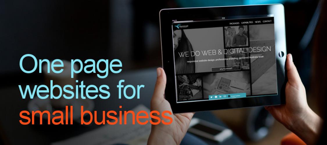
Many industries have tremendous potential to use a one-page website to attract potential customers and have long existed in web design to create the proper exposure for business. For multiple years one-page websites have received significant accolades and awards.
Having a one-page website (which is different to a single page application) that displays all your business recommendations in a one-page load can help potential customers see whom they are engaging with and the benefits of doing business with you. It gives you a powerful tool to amplify who you are, what you are doing, how you can assist and how others see you.
When should you use a single-page website? The difference between an open-page website and a multi-page website depends on various lines of investigation in this article they suggest the cons of single-page are following.
The pros of single page website design
Why opt for a single page design for your website over a multi-page design? For starters, successful single page websites are clean and comprehensible. A single page website, that splits content into small chunks and removes UI clutter, is easy for users to digest.
Having content splits that creates a more uninfected busy page for your customer with easy to access content is powerful and supports an individual wanting to reach out to you. What elements are needed that will increase the persuasiveness of a conversion, experimenting how this can be achieved can be brought in several ways.
What does my one-page website design need?
Let's start with displaying your information that is a niche to the market segment. Using engaging visual aids like images and video is always beneficial. Communicating your personality to a customer is helpful as this allows potential clients to see whom they are dealing with. When a web designer creates a design for you, they usually try to make the following outcomes to promote the businesses brand.
- Make sure the web design and content amplify your personality
- The information needs to be relevant to the market
- Don't make your content overly excessive
- Give the information context, so the customer understands it
- Make the web design clear to read and follow
- Explain what your brand stands for
- Make all your contact details very easy to find
- Display your recent work and the skills you have to create it
As you can see, a one-page designed website really can display sufficient information. The advantage to your brand is the ability to state authority and give the person looking at the website that you can be trusted.
I now have a great web design. What's next?
Once you have completed these steps, you are now able to promote your site. Encourage others to see what you have done. When potential clients engage with you about your services or products but have not entirely made up their minds, now you have a tool that has all of the above attributes to give you a chance to close the deal. Yes, if someone can visually see the benefits for themselves, it will provide you with the edge over your competitor's website, which will only benefit your business and promote your brand further.
